Erika has been taking professional business photos for a long time. 2 years ago, she added style coaching to the photoshooting, and a suit salon even lends 2-3 suits for the photo shoot.
Erika wanted a visual identity for her well-functioning brand.
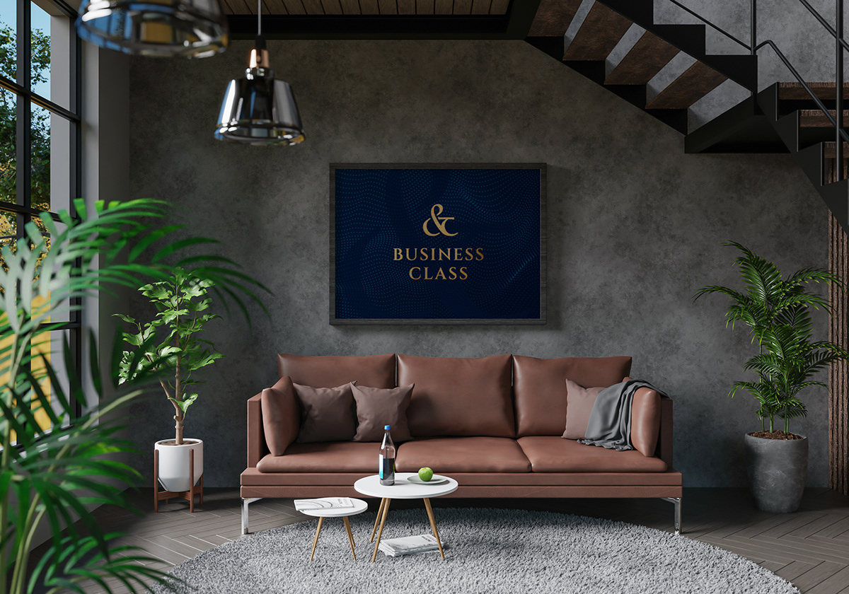
She wanted an elegant, professional look with a little twist...
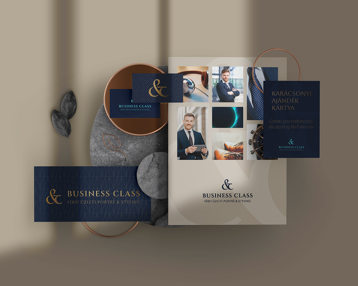
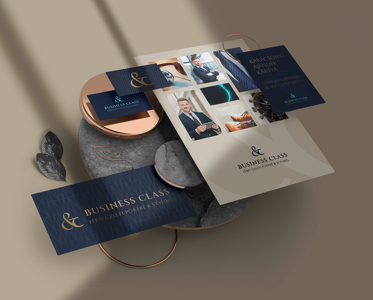
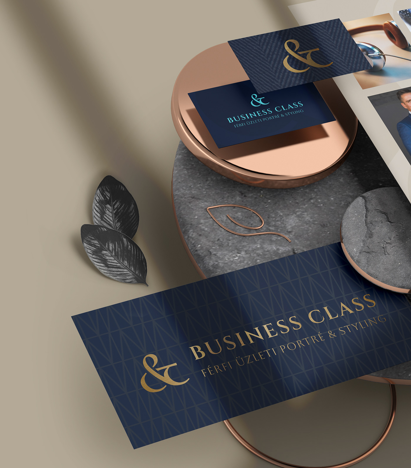
That is why we chose nightblue, medium blue, cornflover blue, beige, ocher and light ocher and the extra color is turquoise blue. And the gold of course.


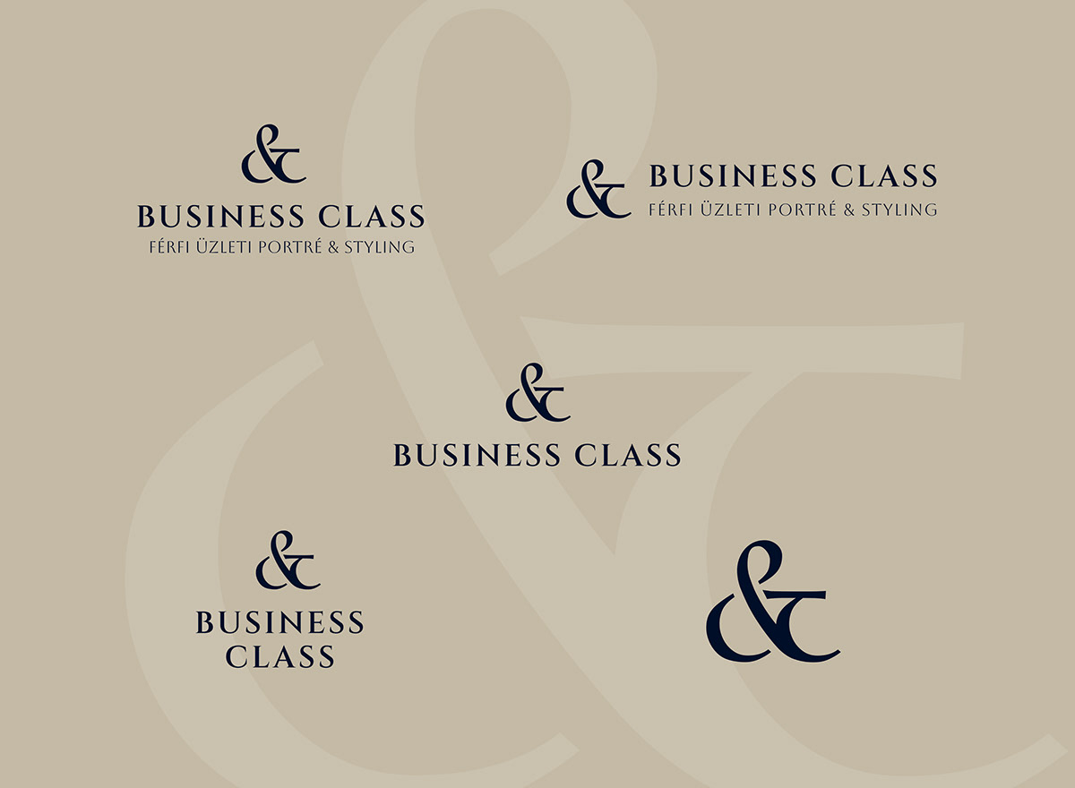
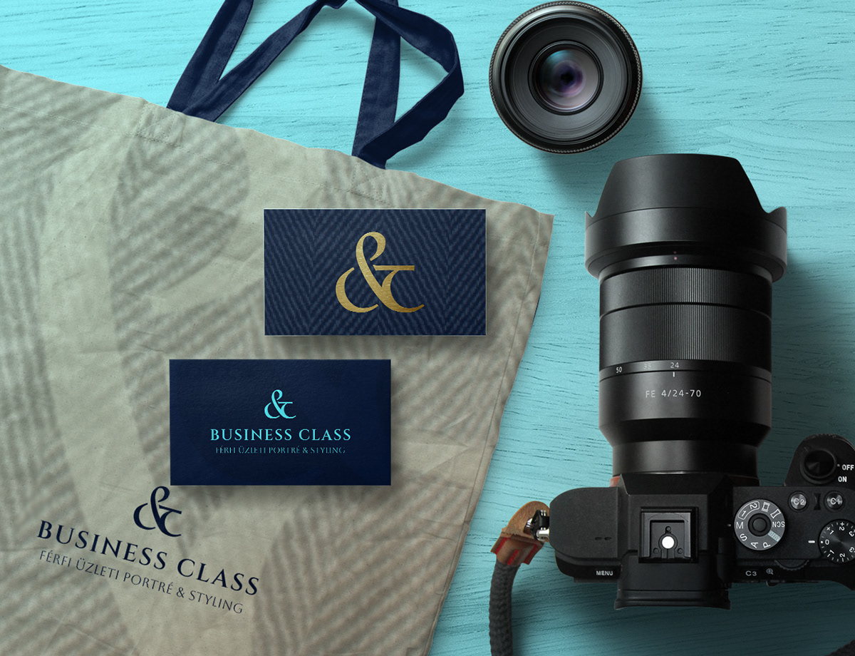
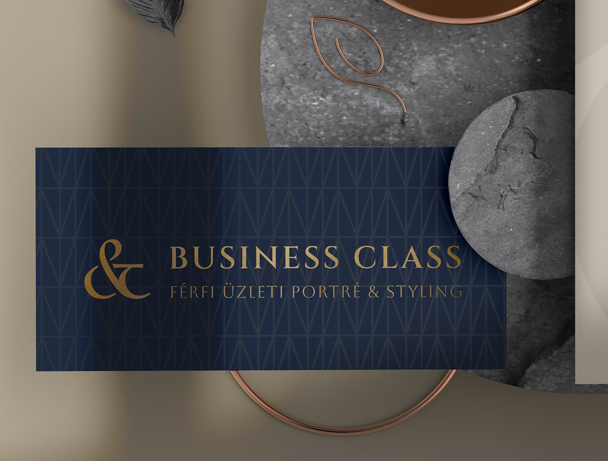
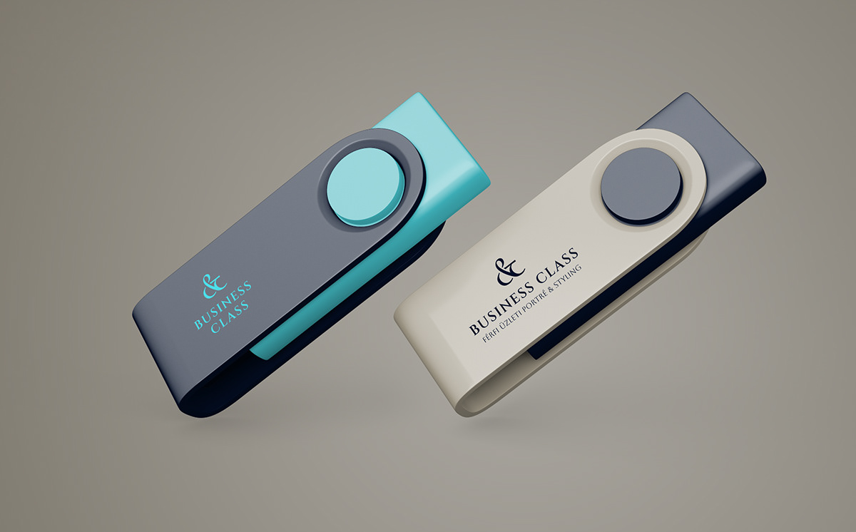
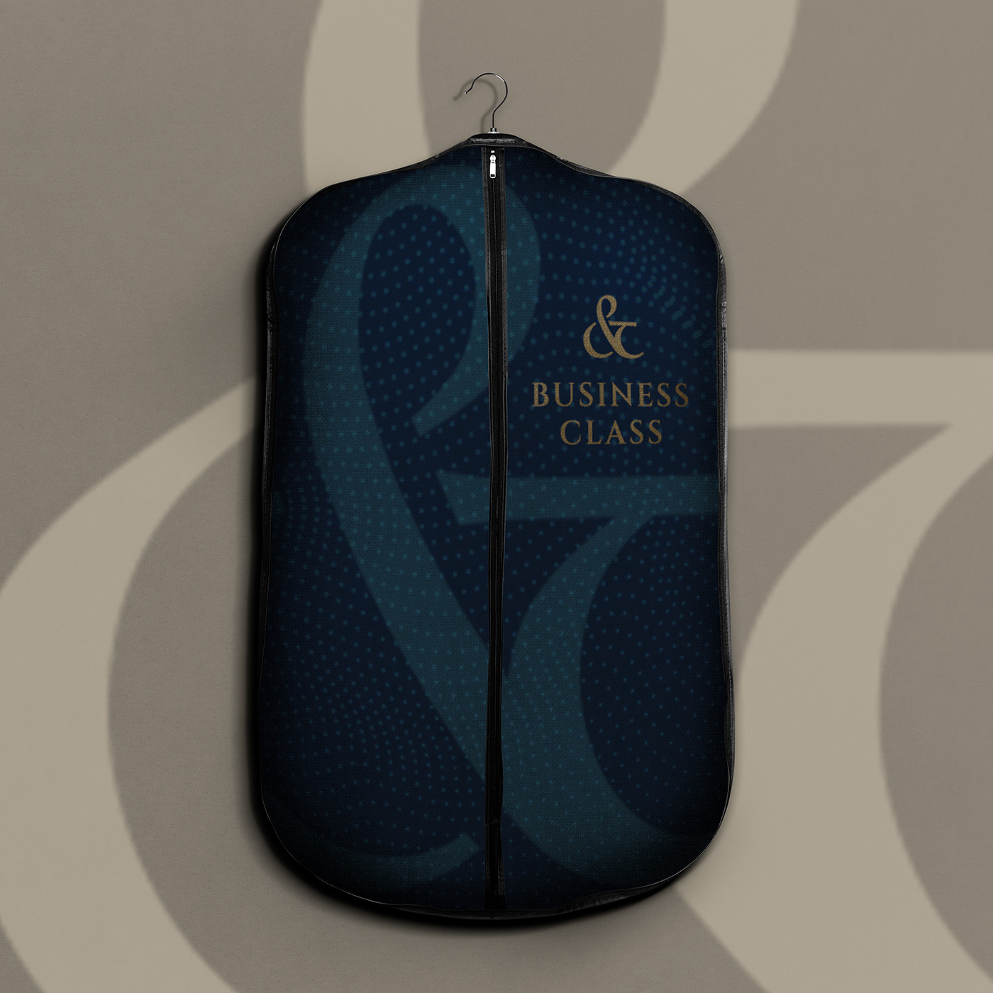
We examined 3 exciting ways from the letter logo to the reduced cuff shape, but in the end the & sign, which played an important role, became the emblem of the logo with a twist, since the service consists of 2 parts that strongly influence each other.
The extra meaning: the & sign has been given so much extra content that the letters b and c also appear in it referring to the name.
Thank you for watching!


